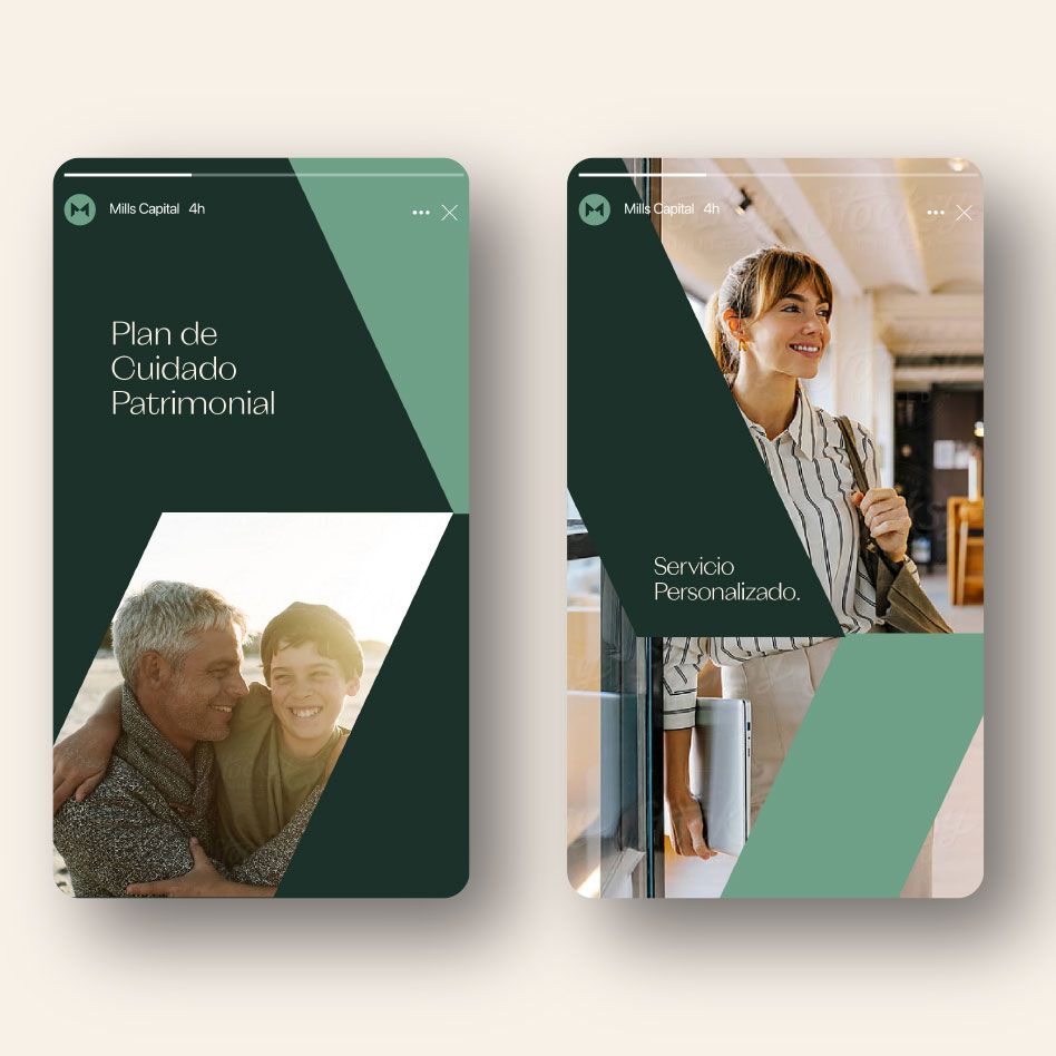
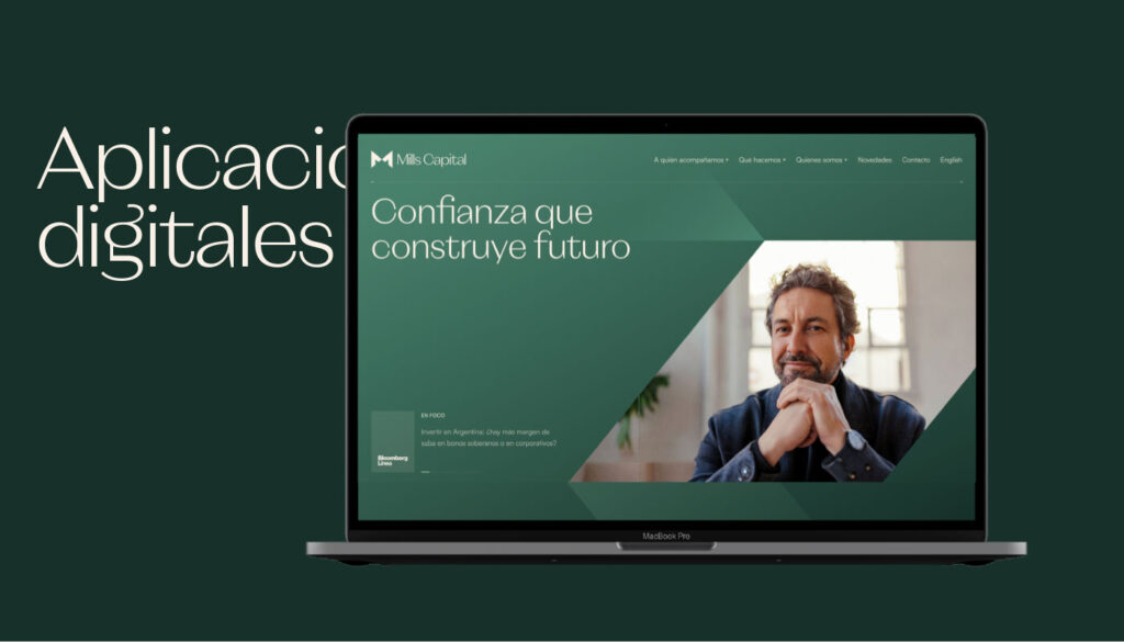
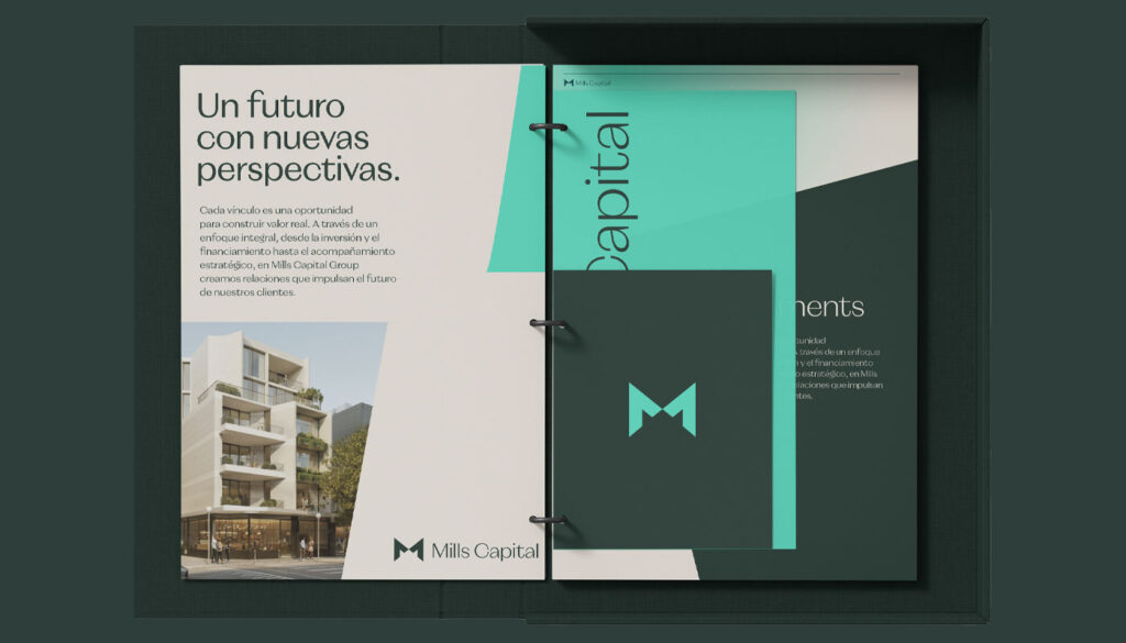
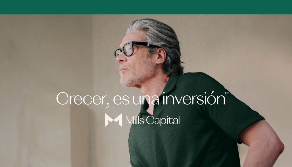
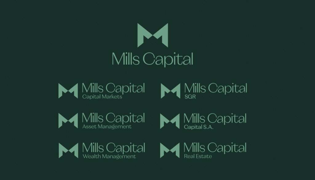
Mills Capital is a fully integrated financial group that guides companies, families, and entrepreneurs through complex decisions in investment, financing, and wealth planning. We partnered with the firm to elevate its brand presence by redefining its visual identity, building a clear brand strategy and brand architecture, and creating a new branding system to support its launch across the United States and Europe.
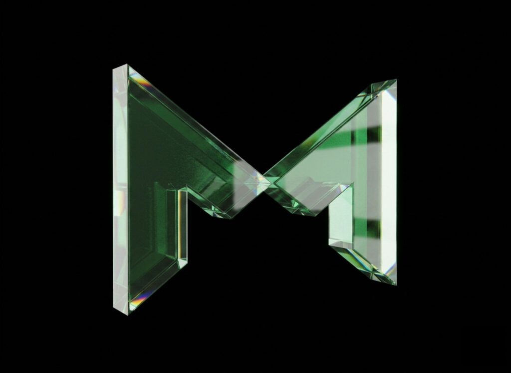
The Mills Capital logo combines a solid geometric symbol with elegant, contemporary typography, creating a perfect balance between institutional strength and human approachability. The design reflects the company’s core values: approachability, commitment, trust, and speed.
The main figure originates from the initial “M,” constructed with precise, angular lines that convey strength, structure, and professionalism. Its symmetry suggests balance and control, essential attributes for a firm dedicated to capital management.
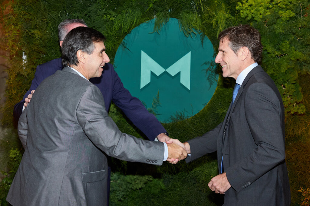
Human Representation: Beyond its typographic interpretation, the shape of the “M” represents two people approaching and shaking hands, a universal gesture of trust, respect, and collaboration. This duality symbolizes the close relationship between Mills Capital and its clients, based on transparency, commitment, and shared growth.
Negative Space and Convergence: The point where the shapes meet suggests a center of balance and strategic convergence, evoking the idea that financial success arises from teamwork and a shared vision.