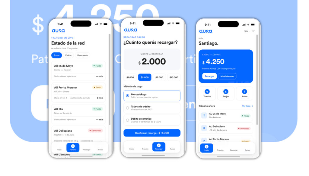
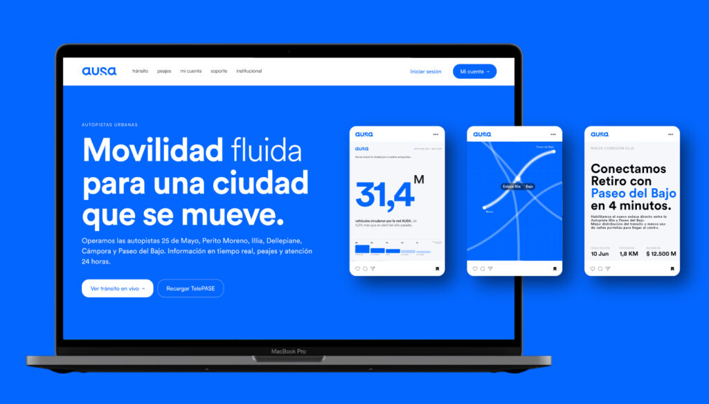
Moving around the city is part of everyday life. It’s about schedules, routines, and encounters. That’s why we believe mobility should feel simple, natural, and seamless. When something flows, it goes unnoticed; it’s a natural part of life.
We design with those who use our roads every day in mind, striving to make each experience more agile, intuitive, and pleasant.
Because when mobility becomes human, the city feels lighter.
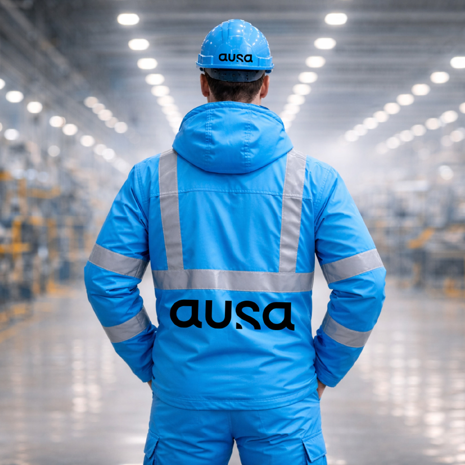
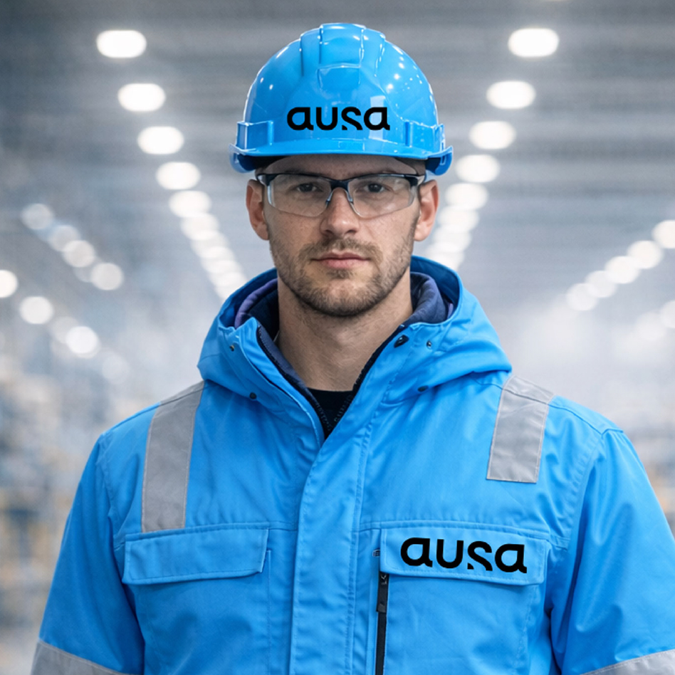
AUSA’s new logo represents a clear evolution: from a company exclusively associated with road infrastructure to one leading the technological transformation of urban mobility.
The lowercase typography conveys approachability and modernity. The rounded, continuous shapes eliminate rigidity and transmit fluidity, evoking the constant movement of traffic when it operates efficiently.
There are no sharp angles or abrupt interruptions: everything in the design suggests continuity, flow, and a frictionless experience.
The internal cuts and smooth transitions between curves introduce a key idea: integrated technology. Just as intelligent systems optimize traffic flow in real time, the typography integrates precision and dynamism into a single visual gesture. The result is a brand that feels agile, digital, and contemporary.