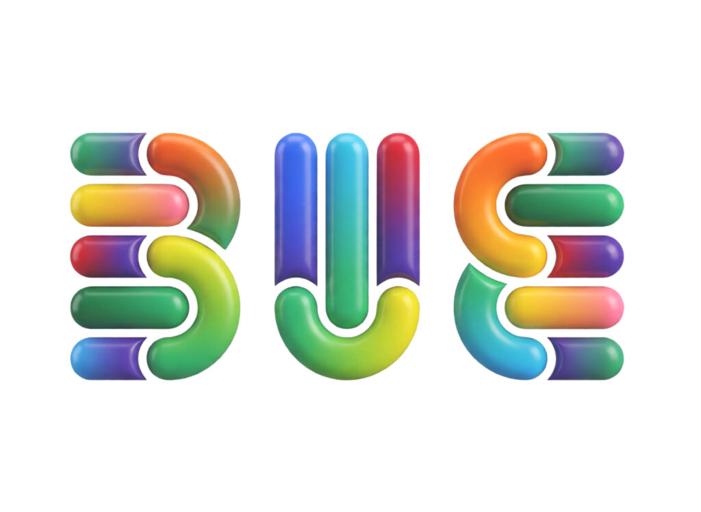
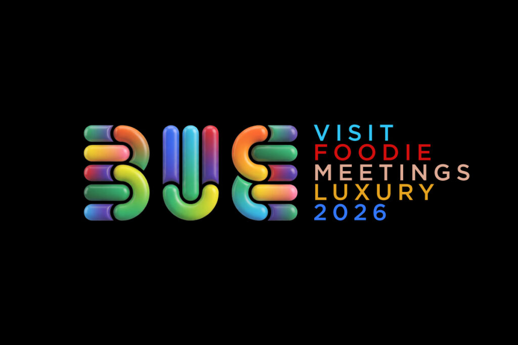
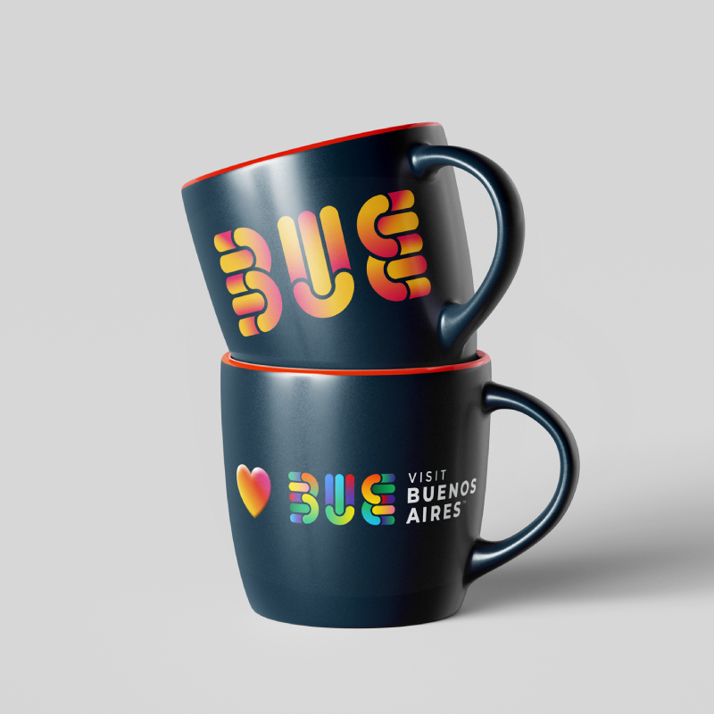
As part of the evolution of BUE’s identity system, the color palette was expanded to lend greater personality and distinctiveness to its strategic sub-brands. This decision enables the creation of unique visual worlds for each segment while maintaining overall brand coherence and recognizability.
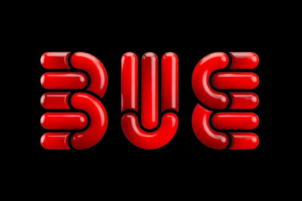
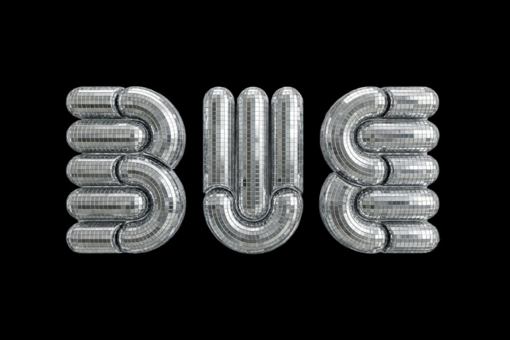
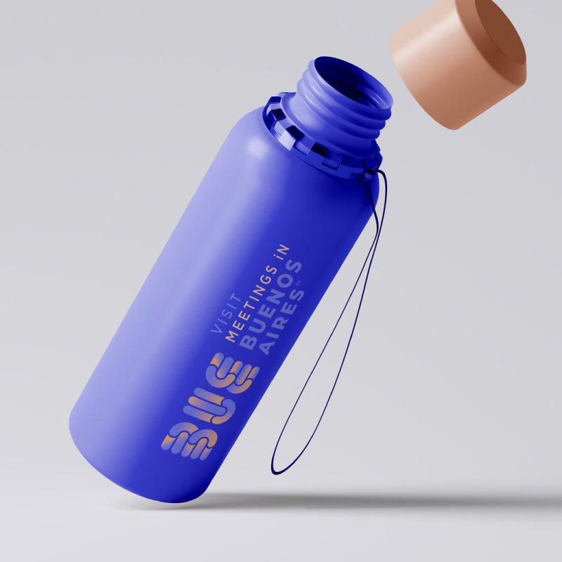
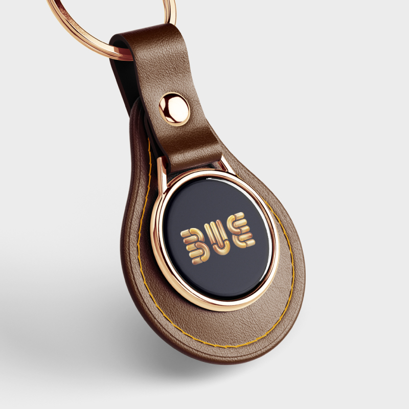
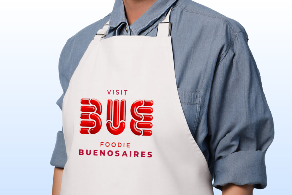
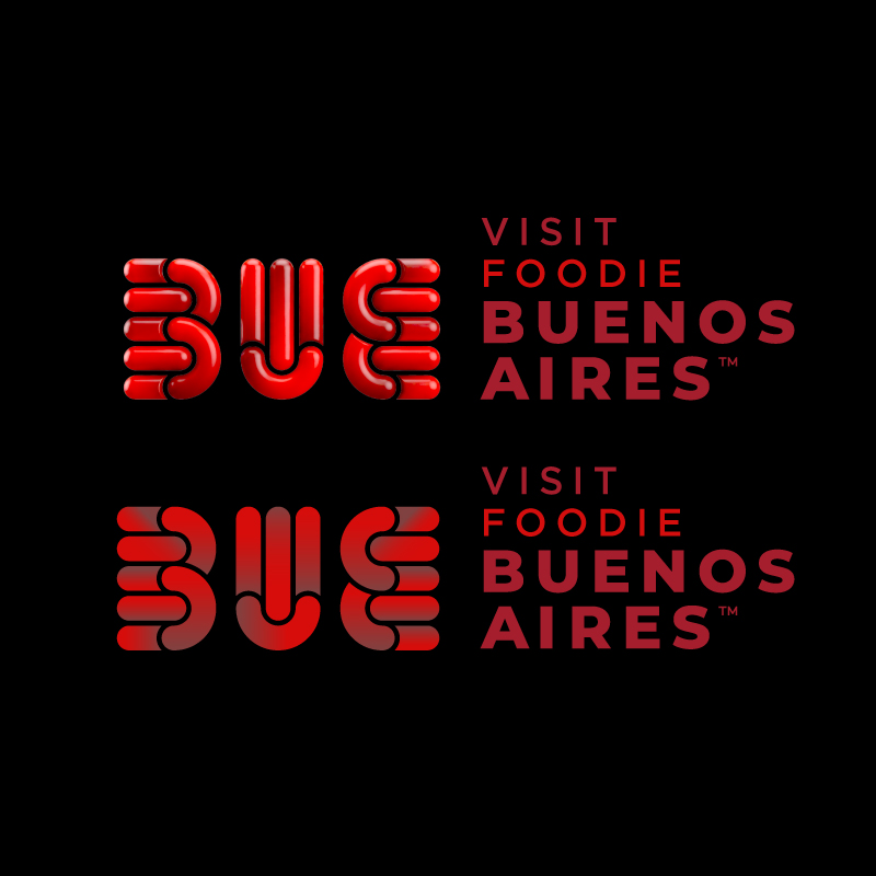
The new visual architecture introduces a color scheme tailored to each category—drawing on cultural codes, associated perceptions, and industry-specific references—alongside a new graphic treatment that shifts from 2D to a 3D format.
Through these new color and graphic configurations, BUE enhances its ability to adapt to diverse audiences and contexts, strengthening differentiation between categories without compromising the visual coherence of the brand identity.
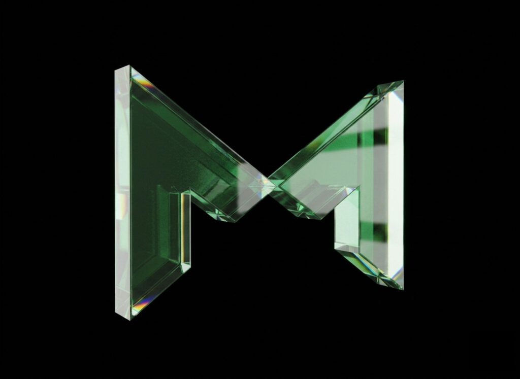
The color identity of Meetings draws inspiration from environments associated with the corporate world, business, and innovation. The color selection is inspired by the visual languages found in presentation platforms, data analysis tools, flowcharts, executive reports, and digital interfaces used in professional contexts.
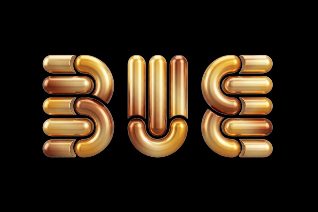
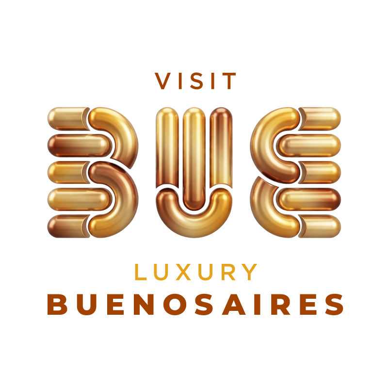
The color palette for Luxury is built upon visual codes historically associated with the premium realm. Gold tones serve as a conceptual starting point, evoking attributes such as exclusivity, sophistication, quality, and prestige.
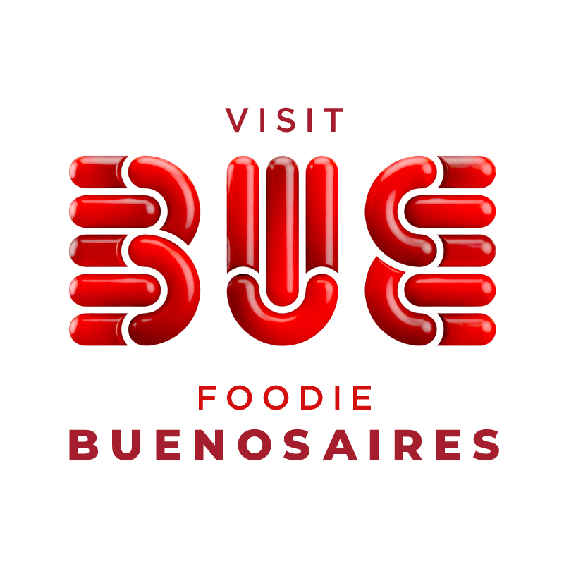
The Foodie identity draws inspiration from one of the city’s key cultural assets: its gastronomy. The color palette evokes elements deeply rooted in the local culinary imagination—such as embers, fire, the cooking process, meats, and ingredients central to the Argentine gastronomic tradition.