ARGENTINE BICENTENNIAL 2016.
Change in continuity. Branding system based on the 2010 symbol.
The graphic symbol that identifies the 200 years of Argentina’s Independence is a redesign of the symbol created for the celebration of the Bicentennial of the May Revolution in 2010. A symbol that became firmly established in the social imaginary throughout the six-year period 2010 – 2016, whose visual signature character assumed a leading role in terms of dissemination, identity and brand capital.
The graphic brand of the 200th anniversary of Argentina’s Independence faces such competition. It continues to apply the same formal concepts while updating the features of its linguistic and visual sign with substantial differences.
With the collaboration of Designer Juan Pablo Tredicce


In the search for differences between the two brands, both rational and intangible aspects were reviewed.
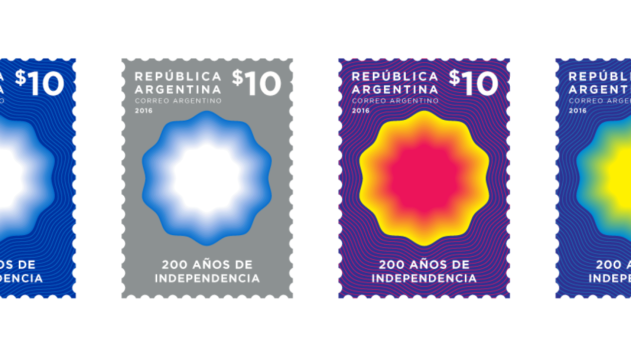
The new symbol replaces the petals that surround and give shape to the cockade with twenty concentric filigree shapes that diminish in color towards the interior of the figure. Each one, representing the twenty decades that have passed since 1816. Between the idea and its materialization, the change is solemn, effective and positive – although rigorous in the continuity of its morphology, which does not modify its contour at all.
If in 2010 the brand simulated transparency effects, here it evokes the principles of optical art, connoting a sun at the center of this meticulous technique. The symbol consolidates a language of visual grammar. In reference to intangible aspects, the symbol of the 200th anniversary of Argentina’s Independence defines a strategic way of thinking, both in vision and visual style.


Why does Argentina need a brand? There are many reasons, including aspirations for internal consensus, recognition and autonomy. But mainly because, even with its quandaries, the symbol can become an essential component of the Nation’s diplomatic and competitive strategy in the global context.
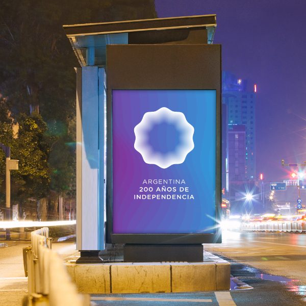
Through a rigorous implementation program, the graphic symbol of 200 years of Independence represents a vehicle that contemplates culture and image as a unique and recognizable concept, with local spirit and international aspiration.
If, as Chermayeff & Geismar say, after all, a graphic mark is both form and substance, image and ideas, the new symbol evolves flexibly in an appropriate tone of voice. It is clear, however, that the mere diffusion of a graphic mark cannot identify the totality of meanings of the political object it represents. However, it connects – perceptually – brand management and creative capitalism.


