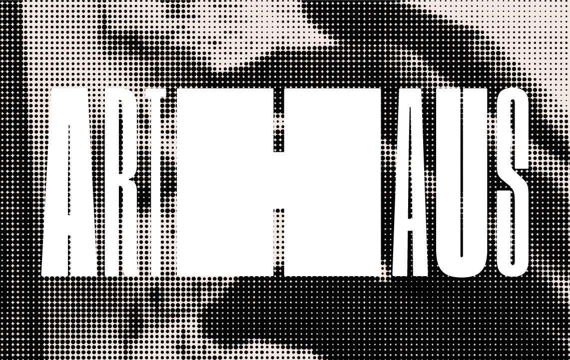
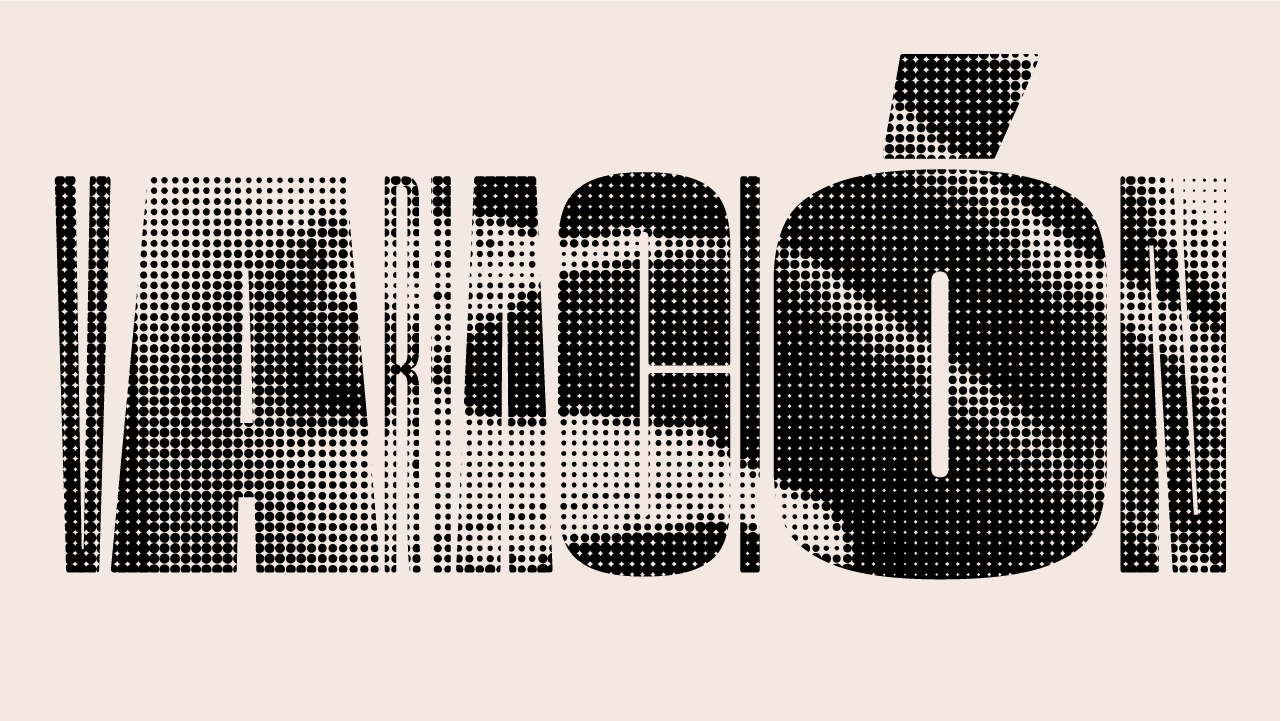
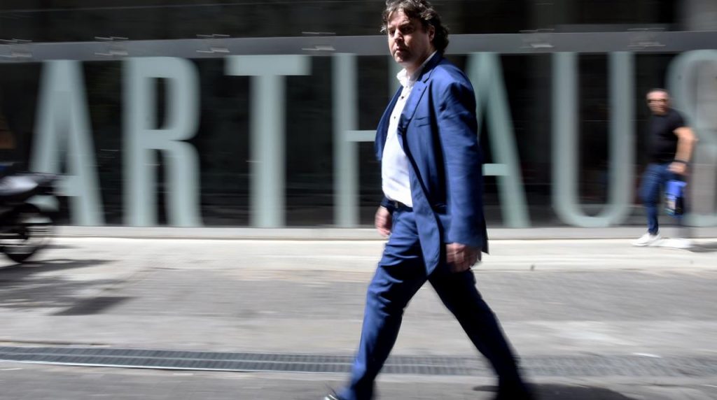
ARTHAUS. Flexible branding system based on a modular typeface.
Just as artistic representations, Arthaus’ graphic identity is flexible and organic.
It is flexible because it resorts to a few elements that transform and combine to show and convey sensations in each piece of design. And it is organic because it is built based on rules that are justified on certain graphic and communicational decisions.